Information on InfoPower Studio 2006
Woll2Woll Software
Jan 25, 2006
InfoPower Studio
allows you to build both VCL.NET and VCL.Win32 applications using Delphi or C++
Builder. They are designed to be backwards compatible with earlier versions of InfoPower. Woll2Woll
has taken great care so that your Win32 applications can be ported to .NET with
minimal effort on your part.
The following document details some of the new
functionality in InfoPower.
1. InfoPower’s Masterpiece Grid
InfoPower’s masterpiece
grid is one of the most powerful components in the InfoPower
library, greatly expanding upon the capabilities of Delphi’s native grid
component.
In addition to the functionality of the
Delphi grid, InfoPower’s grid supports the following:
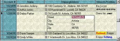
· True Master / Detail Relationships displayed from a single grid
InfoPower brings you a new paradigm to display
and edit your master/detail relationships. Detail tables can be
initially hidden, and then expanded into full view when the end-user expands a
expand/collapse button in the parent grid.
Each child-grid is fully customizable as in the parent grid, and the
control preserves the liveness of each expanded
detail grid.

· Expand/Collapse buttons for composite calculated fields
Use expand/collapse buttons to allow the user to edit
a composite field. You can display a calculated field such as full name
(composed of first name + last name)., and then the user can expand the
composite calculated field to edit the individual portions.
· Improved custom control integration and flexibility
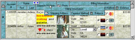
InfoPower allows you to embed a wider variety of
controls in the grid. You can now even
embed non-InfoPower controls, such as the TDBImage. The grid also allows each custom control to do
their own painting in the grid so that even graphics, richedits,
etc. will be displayed for every row in the grid
without any code on your part. The data inspector can also be embedded in the grid, giving a
multi-row record display. The new checkbox and radiogroup
controls can also be embedded, which significantly improves the versatility of
the grid.
Woll2Woll’s 1stClass buttons can seamlessly be integrated
into the InfoPower grid, giving your grid a clickable
component for each record. In addition
the button colors can be dynamically computed allowing the color to be
different based on the record information.
· Grid header enhancements
The
titles in the grid can be displayed and managed hierachically.
This allows you to group related fields together. Also for header dragging
operations, the grid more clearing indicates the new placement of the column.

·
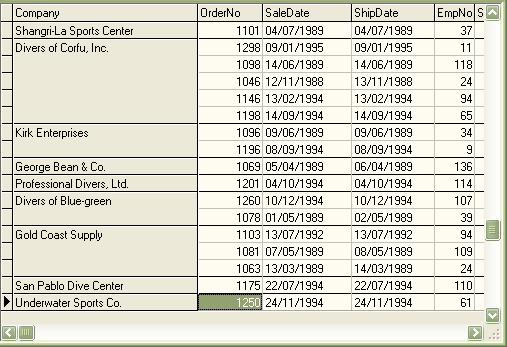
Allow
grouping of related data in grid
In some cases you may have data that you wish to display
as a group in the grid. InfoPower allows you to display this information as a group
by only displaying the text for the first instance, as well as removing the
lines in between. See the Company
field below.
· Ditto Capability
Allow the user to conveniently copy the previous record’s
value into the cell.
· Flicker-free display
The
grid improves both its painting performance and visual effect with its new
flicker-free display.
· Background texture tiling
InfoPower allows your applications to further
impress by adding support for background texture
tiling. The component takes care of blending your tile with the color of the grid
region, giving you a truly impressive and professional display.
· Support for exporting from the grid to various formats.
InfoPower supports exporting to various formats
to aid your end-users in extracting their displayed data to be used with other
applications. In addition you can copy the selected records to the
clipboard. See the following for an
example of the generated html.
http://www.woll2woll.com/infopower/exportexample.html
· Clickable URL link support
Define
columns as URL links (i.e. Email addresses). The grid will automatically handle
its display and the opening of the link.
· Native Alternating color
New
property to automatically alternate the colors of the rows in the grid. This provides a pleasing look to the end-user
and helps differentiate one record from another.
·
Proportional column sizing
The
grid can now automatically size all the columns to fit perfectly in the grid’s
client area. If the grid is resized, all the columns still fit perfectly. Any
trailing column space after the last column is removed.
· End-user row sizing
User’s
can enlarge the sizes of the rows by dragging the horizontal line in the
indicator column
· Fixed column enhancements
Editable
fixed columns, resizable fixed columns
· Line color customizations
You
can now override the default line colors
· Clickable Column headers

Title
Buttons in the Column headers allow you to easily change the index or sort
order of your dataset.
· Define fixed, non-scrollable columns
Just
set the FixedCols property to indicate the number of nonscrollable columns to display in the left-hand side of
the grid.
· Supports InfoPower’s powerful picture language:
·
Auto-sizing
of column
Dbl-clicking the sizing line for a grid can automatically
grow or shrink the column’s width, based on the widest displayed text in the
column
Use
picture-masks to assist and validate your data entry when editing cells in the
grid.
· Customizable cell-level hints
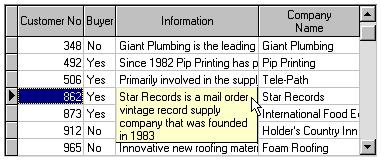
Customizable
Cell-level hints when the cell’s text does not fit in the cell. Excellent when
used with memo fields to display the entire contents of the memo just by moving
the mouse over the cell.
· Persist user’s grid settings
Saving and loading of the user’s runtime settings of the
column positions and widths from the registry or an inifile
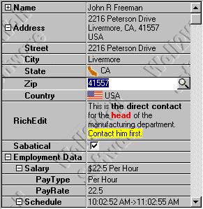
2. InfoPower’s Vertical Grid (DataInspector)
InfoPower allows you to display a transposed grid where the data columns are
vertical, instead of horizontal. This
brings your end-users a smart alternative to the left-right editing of a
traditional grid. The vertical grid’s flexibility can be seen through its hierarchical
view of data (similar to a tree).

· Improved custom control integration and flexibility
InfoPower allows you to embed a wider variety of
controls in the inspector. You can now
even embed non-InfoPower controls, such as the TDBImage. The inspector also allows each custom control to
do their own painting in the grid so that even graphics, richedits,
etc. will be displayed for every row in the grid
without any code on your part.
· Background texture tiling
InfoPower allows your applications to further
impress by adding support for background texture
tiling. The component takes care of blending your tile with the color of the
inspector region, giving you a truly impressive and professional display.
· Alternating colors for rows
New
property to automatically alternate the row colors and to highlight the active
column
· Enhanced hierarchical display
When
items are expanded., the inspector now paints tree lines supporting an elegant
tree display.
· Group Related fields together
Using
this control you can group related fields together in categories. Thus
providing an organized view of data. You can even display data from different
datasets.
· Use it Unbound (without a datasource) or with a single record.
You can even use this control
unbound just like the Delphi object inspector.
3. Superb Validation language
InfoPower gives you incredibly flexible and expressive picture
masks which greatly assist in automatically validating your user's input. InfoPower's masks duplicate the Picture function that's
been available in Borland's Paradox relational database product, providing the
power of a full mask language instead of just a mask template. Picture masks greatly
assists the end-user during data entry by intelligent auto-filling of
characters where appropriate as well as informing them if they have incorrectly
entered any data. This allows data entry to be faster and easier.
Here are some examples of the power of picture masks.
· Street Address Capitalization
The first letter of each word is
automatically capitalized. For instance, if the user enters “235 quinault way”, InfoPower
conveniently converts the input to “235 Quinault Way”
as they are
typing.
· Masks which contain optional sequence of characters
Such as an optional zip code suffix in
a zip code. If the user does not match
the format defined by your mask, you can inform the user visually or prevent
the control from losing focus..
· Intelligent auto-filling of characters as the user types.
The user’s keystrokes can be minimized
as the mask language can fill in the static characters. For instance with a SSN mask of ###-##-####,
the dashes (-) can be automatically filled in so that the user just needs to
type in the numbers.
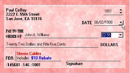
4. Custom Framing & Transparent Edit Controls
InfoPower
gives you the means to create elegant forms that look just like the real
hardcopy form they are based on. You may see other component suites that allow
you to turn on or off the borders, but do they allow you to see the background
through the edit control for true underlined controls? InfoPower
does. The new features that InfoPower has added to
it’s edit controls are:
·
Different Border Styles
However the custom framing goes far beyond simple underline controls as you can display the borders in many different frame styles (bump, raised, box, single, etched, etc).
· Selective Borders
You
can selectively turn off the top, bottom, left, and/or right borders around InfoPower 2000 edit controls.
· Focus and NonFocus Settings
What’s
more is that you can customize these settings depending on the focus of the
control.
·
Transparency
No
other VCL gives you all this and the ability to have controls display
transparently on your backgrounds. Drop a TImage onto
the background of your form and place InfoPower
controls and any other VCL Control and you will immediately notice the
difference.
·
Custom
Glyphs and Transparent Effects on Buttons
The
combo buttons in the edit controls can also be displayed in a flat style and
transparently as well for an extremely natural look. Notice the buttons in the
edit controls in the screen-shot above, you can also load your own custom glyph
in any of our combo controls.
·
Hot-tracking
Hot-tracking
of border styles similar to Microsoft Office
5. The Ulitmate Word Processing Control
 InfoPower includes a powerful visual component greatly expands
upon the capabilities of Delphi’s built-in richedit
component. It is the most complete and powerful richedit
control available. In addition to the functionality of TDBRichEdit,
InfoPower’s control provides you with the ability to:
InfoPower includes a powerful visual component greatly expands
upon the capabilities of Delphi’s built-in richedit
component. It is the most complete and powerful richedit
control available. In addition to the functionality of TDBRichEdit,
InfoPower’s control provides you with the ability to:
· Bitmap and OLE support:
Embed
bitmaps & OLE objects directly into the richedit
control. You can even save these to your database.
· Paragraph Ruler:
Set
paragraph indentations within the pop-up rich-edit dialog using an accurate
ruler.
· Internet URL Links:
URL
addresses in the rich-edit text are automatically underlined. The component
will also automatically open the specified URL with the Internet Browser.
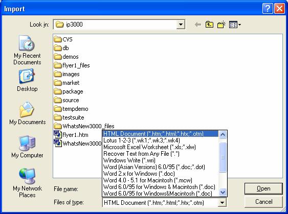
· Import and Export to HTML
Import
or Export to HTML, import from Microsoft Word. Also supports many other
formats.
· Database Search and Filter:
After
storing RTF text into database blob fields, you can still have access to InfoPower's powerful database searching and filtering
capabilities.
· User-definable speed buttons:
Developer
can add their own speedbuttons to the pop-up richedit dialog to integrate other 3rd-party tools such as
RTF spell checkers.
· Integrated RTF Word processor:
End-user
can bring up InfoPower's powerful RTF word processor
to give them a full WordPad-like environment.
· Customize printer margins, orientation, and paper size:
Supports
end-user customization of the page layout using the Win95 PageSetup
common dialog.
· Find/Replace dialog support.
· Extensive pop-up menu support:
Right-click
this component to see an example.
· Design-time support for entering rich-edit text and OLE into the control.
Delphi's
version cannot store formatted text into the a control during design time.
·
Seamless
integration
Easily
embed into InfoPower's RecordView
components or attach to a TwwDBGrid to allow the enduser to use the popup wordprocessor
to edit RTF fields in the database. The grid will display the unformatted text
inside the grid cell.
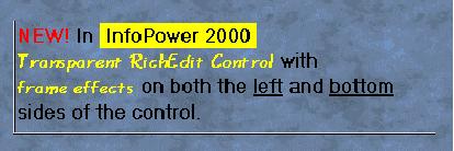
·
Supports
Transparency and Framing effects.
The
richedit control can now be displayed transparently
when it does not have the focus. Disable the control and set some of the
framing properties and you can use this control as a RichEdit
label.
·
User
highlighting of text.
The
end-user can now set the background color of selected text. This allows certain
text to standout. User highlighting is integrated as a new button in the word
processor.
·
Word
processor supports bitmapped menus.
The
word processor has updated the appearance of its menu by displaying bitmaps
next to certain menu selections.
·
New
events to customize the menus in the word processor.
You
can now more easily change the behavior of the common menu selections from the
word processor with the introduction of the following new events: OnMenuLoadClick, OnMenuPrintClick,
OnMenuSaveAndExitClick, & OnMenuSaveAsClick.
·
Integration
with Microsoft Office’s Spell & Grammar Checker (not
supported for C++ Builder) 
· Header and Footer support
When
printing the richedit contents, a custom header and
footer can be part of the hardcopy printout.
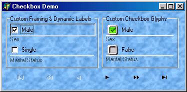
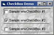
6. Flexible Checkbox Control
InfoPower
integrates a versatile new checkbox control into its suite.
· Support for your own custom bitmaps for the checkbox glyphs
· Support for 3 states including integration with the InfoPower grid, record-view components, and data inspector.
· Dynamic caption support – The text of the checkbox can change to reflect the underlying value or mapped value.
· Custom framing and transparency support for a consistent look with other InfoPower edit controls
7. New Custom Radio group Control

InfoPower
integrates a versatile radio-group
control into its suite.
· Support for your own custom bitmaps radio-button glyphs
· Support for additional glyph for each radio item
· Integration with the InfoPower grid, record-view components, and data inspector.
· Custom framing and transparency support for a consistent look with other InfoPower edit controls
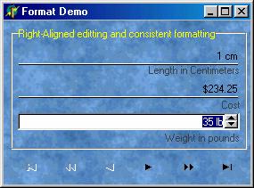
8. Currency and Numeric editors
InfoPower brings
consistency to editing your numeric and currency fields. Its components give the end-user the ability
to enter in the special currency or custom formatting symbols, and the component
will automatically take care of stripping these formatting characters when it
comes time to store the data.
For example, if the user typed in the string ‘$1,000.00’,
the editors take care of stripping the commas and the dollar sign so that the
input is converted correctly to a floating point value when storing.
The numeric editors also now support right-aligned editing.
9. Smart and flexible Combo-boxes
InfoPower greatly expands the capabilities of a regular data
aware combo-box. It has the following advantages over the native controls.
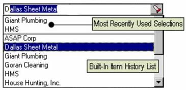
· Combo-boxes with automatic history and MRU lists.
InfoPower gives its combo-box the ability to
remember the user’s previously entered values.
The next time the user’s program is executed, these previously entered
values are automatically filled into the combobox’s
dropdown list. You can also specify a
separate MRU list so that the most recently entered entries appear at the top
of the list.
·
Mapped
Display Values
Allows
you to enter mapped storage and display values so that you can display
understandable text versions of stored codes in your table, instead of
displaying only the codes themselves where users have to remember what they all
mean.
·
Quicken
Style Searches
All
of InfoPower's lookup components support the 'Quicken'
style display of the matching value, by simultaneously searching and displaying
the matching text in the search control.
·
Additional
Published Properties
Since
InfoPower is derived from the InfoPower
base editor class, you can access the following additional properties which are
not available in Delphi’s native combo control: AutoSelect,
AutoSize, BorderStyle, CharCase, MaxLength, and InfoPower’s validation language PictureMask
property.
·
Framing
and Transparency
Supports
customizable borders, border styles, as well as transparency.
·
Flat and
Transparent Button Effects
The
combo buttons in the edit controls can also be displayed in a flat style and
transparently as well for an extremely natural and updated look.
·
Custom
Glyph for DropDown
The
glyph in the combo is configurable through the control’s ButtonGlyph
and ButtonWidth properties.
10. Advanced LookupCombo Controls
· TwwDBLookupCombo, TwwDBLookupComboDlg
InfoPower gives you the most flexible component
for selecting entries from a lookuptable. Here is
some of what this powerful component can do.
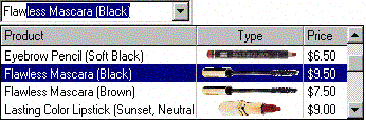
·
Quicken
style incremental searching
All
of InfoPower's lookup components now support the
'Quicken' style display of the matching value, by simultaneously searching and
displaying the matching text in the search control.
·
Multiple
Columns in the DropDown Box or Popup Dialog
Select
any number of fields to be displayed in the drop-down list along with defining
their display width and optional titles. Also define in which direction the
drop-down list should grow in width, either to the left or to the right,
depending on where the component is located on your form.
·
ImageList Support
in dropdown
With
the ImageList Support you can display a column of
images in the dropdown list.
·
Sorting
flexibility
The
values in the drop-down list are sorted in the order of the first field you
select to be displayed, if it's a secondary index field, instead of being
sorted in primary key order.
· Support for many dataset types:
Fll a drop-down list with a table, query, QBE, ClientDataSet, and even parameterized queries.
· End-user Usability enhancements:
Smart
properties to auto-drop down the list upon a valid keystroke as well as a
convenient way of clearing the Lookup Combo's Text.
· Embed into InfoPower's Grid and RecordView components:
The
component can be used in a TwwDBGrid component to
replace any multiple-choice type of field in the grid, giving your end-users
sophisticated lookup and fill capabilities within the grid or record-view
components.
· Use unbound or bound
The
component does not have to be bound, or assigned, to a table's field (DataField and DataSource
properties) which gives you greater flexibility in using this LookupCombo for general tasks where a source table is not
involved.
·
Selectively
filter the drop-down list
Show
only the relevant records from the lookup table by attaching to a dependent
table, using paramaterized queries, or filtering the
dataset related to the drop-down list.
·
Framing and Transparency
Use
InfoPower’s custom framing to customize how the
controls borders and background are painted.
11. Fast Search and Filtering Components and Dialogs
12. Visual Filtering
InfoPower's elegant TwwFilterDialog is
one of the most useful end-user components as it enables them with the ability
to visually filter a dataset, modify the where clause of an existing SQL query,
or even filter records in Delphi's TClientDataSets.
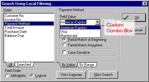
Simple
for the end-user to use:
Even though the dialog is capable of sophisticated SQL generation, the dialog
is simple to use as it completely hides the filtering and SQL details from the
end-user.
· Unmatched filtering power:
Your
end-users can specify a search value, or a range, for any number of fields
contained within the dataset.
·
WildCard Filtering
within Fields
Select a specific type of data match to be
performed within the field, such as "From beginning of field",
"Anywhere within the field", and "Exact match".
·
Special
customizable keywords
Specify
keywords such as "AND", "OR", "NULL" to specify
multiple filter criteria for each field, such as... John OR Paul. InfoPower also allows the end-user to easily see all
non-matching records.
· Filter even on memo fields, or blob fields containing Rich Text Format
·
Fast
performance
Support
for filtering on the server side for fast performance! When using the component
with a TQuery object, you can have the back-end
perform determine which records should be included in the view.
·
Automatic
Aliases for user entered text
You
can now map user-entered text to a specific database value. This can allow the enduser to filter based on some more meaningful text even
if that text is not stored in the database. For instance if the database was
storing the codes 1, 2, 3, and they respectively represented the strings ‘
Visa’, ‘Mastercard’, ‘American Express’, you could
allow the user to enter the string ‘Visa’ instead of ‘1’ to find all customers
who used a visa card.
TwwKeyCombo
If your end-users want a way to sort or incrementally search on other fields,
then just drop our database sort component onto your application.
·
Automatically
displays all available indexes
The
drop-down selection list is populated with the DisplayNames
of all indexes available for the table that it is assigned to.
· Support for all fields of a ClientDataSet or ADODataSet
You
can incrementally search or sort-by any field in datasets that support local
mode.
TwwIncrementalSearch
TwwIncrementalSearch is a visual interface component
that provides your end-users with a means to incrementally search for values.
As the end-user enters characters into the edit box, the component performs a
search operation based on the characters currently in the edit box, moving to
the record that contains the closest match
·
Perform
Quicken Style Searches
Set
ShowMatchText to true to have Quicken Style
incremental searching by simultaneously searching and displaying the matching
text in the search control.
·
Fast
Performance
Automatically
uses any available index to enhance performance when doing the lookups.
· Supports InfoPower's flexible picture masks.
·
Framing
and Transparency
Set
the EditFrame property to customize how the controls
borders and background are painted.
TwwLocateDialog
The TwwLocateDialog component itself is non-visual
but when executed it provides your end-users with a dialog box that allows them
to search for a value within any field, including Memo fields.
· Perform Case-Sensitive or Case Insensitive Exact or Partial Match Searches
·
FindFirst and FindNext Methods
The
built-in FindFirst and FindNext
methods can be executed under program control without displaying the dialog
box. This lets the developer assign any end-user keyboard key, button or icon
to these methods, allowing the user to repeat the last locate command or start
over from the beginning of the table without having to re-display the dialog
box or re-enter their search criteria.
·
Wildcard
searching
TwwLocateDialog provides your end-users with a dialog
box that allows them to search or partial search for a value within any field,
including Memo data type fields, calculated fields, and lookup fields.
TwwSearchDialog, TwwLookupDialog, etc.
InfoPower also includes
other powerful and easy to use dialogs that are let your users find the data
they are looking for. These dialogs support:
- Supports InfoPower's
flexible picture masks.
- User Definable Buttons
Up to 2 user definable buttons are included in these dialogs for your own custom actions. - Useful events for further Customization
Use the OnInitDialog or OnCloseDialog events or any of the other events to further customize how the dialog is used and displayed.
13. Date and Time Controls
TwwDBDateTimePicker:
InfoPower provides the most flexible and usable DateTimePicker for Delphi. DateTimePickers
support drop-down calendars to assist the user in selecting a date. InfoPower's version includes the following functionality.
·
Embed within InfoPower's Grid, RecordView, or FilterDialog
components.
·
Use with or without a database.
·
Smart data entry : Auto-advances when enough characters have been
entered, and auto-fills the date and time when the space key is entered.
·
Display the date in the format of your choice using a format mask. Also
supports International date-time formats.
·
Spins up/down with the arrow keys and preserves the display format during
spinning.
·
Numerous display options for controlling the look of the drop-down
calendar, such as display of week numbers, display of current date, automatic
circling of current date, and support for event based determination of which
dates should be in bold.
·
Support for simultaneous entry of both date and time in the same control.
·
Framing and Transparency
Set the EditFrame property to customize how the
controls borders and background are painted.
TwwDBMonthCalendar
InfoPower's MonthCalendar
control allows you to display a calendar to the end-user.
·
Hide/Show the Week Numbers, Today String, and Today Circle in the Drop
Down Month Calendar.
·
Display one or more months of a year in a single InfoPower
calendar control.
·
Change the colors and fonts of the calendar.
·
Supports configurable pop-up menus when clicking on either the year or
the month
·
Code-based determination of which dates should be displayed in bold. For
instance bold-face weekends, holidays, and paydays.
·
Use with or without a database.
14. Spin Edit Control
The end-user can modify the
contents of the TwwDBSpinEdit by clicking on the up
and down icons. Alternatively they can use the UP Arrow and DOWN Arrow keys. On
Date, Time, and DateTime fields the spinedit will highlight the text that is changing while
spinning, so the user will visually see what is changing.
15. Dynamic Custom Record Viewing or Editing
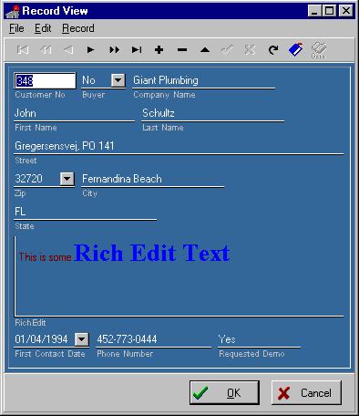
TwwRecordViewDialog and TwwRecordViewPanel
These InfoPower components provide a convenient way
to view or edit a record's contents. The component dynamically creates a form
based on your DataSet's field properties. It removes
the necessity of building custom record editing forms or the need for using
experts for each table. The main difference between these two components is
that one is a popup modal/nonmodal dialog, while the
other is a panel that can be embedded directly on your own form. Some of its
features are:
·
Supports
embedded controls
The
record-view will automatically use the TwwDBDateTimePicker control on date
or time fields, and the TwwDBRichEdit control with RTF memo
fields. It also contains support for embedding custom controls and 1stClass
controls.
·
Flexible
detailed display options
InfoPower's recordview components come with a ton of property settings
that allow you to:
·
Control the
spacing between labels and controls for that consistent look and feel.
·
Choose from a
vertical or horizontal layout for the fields.
·
In vertical
display mode you can make all the edits have the same width.
·
Change a single
property and you can display readonly fields in
another color, hide readonly fields, hide calculated
fields and much more.
·
You can also
easily display background images using techniques listed on our tips page.
· Picture mask support
Set
PictureMasks, add custom menus, grid integration and
much more!
·
Labels
beneath the controls
Set
the Options | tvoLabelsBeneathControls to true to
place labels underneath their related edit control. See picture below for an
example of this.
·
Framing and Transparency
Set
the EditFrame property to customize how the controls
borders and background are painted. For instance, simply set the EditFrame.Enabled and EditFrame.Transparent
properties to True to display the edit controls transparently. Put an image in
the background for truly quick and amazing professional results.
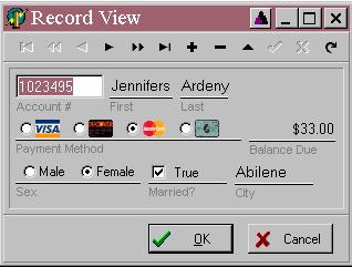
InfoPower allows you to
embed the checkbox and radio-group controls within the record-view components.
In addition, the record-view also supports the new InfoPower
framing styles.
16. Extendable and Flexible Database Navigator

Infopower includes a extendable DBNavigator
component (database navigator to move through and manipulate the data in a
dataset), which supports user-definable images and actions, integration with InfoPower’s dialogs, flexible control over the layout,
user-definable page sizes, and support for multiple rows of icons.
· Extendable:
Add additional speed buttons to the navigator to execute your own custom code.
·
Additional
standard icons
Contains built-in navigator buttons such as bookmarks, InfoPower dialogs, and PageUp/PageDown.
·
Display vertically or horizontally or combine navigators to
get just about any look you want.
·
4-State
Custom Glyph Support
Contains built-in support for animated icons when an enduser moves their mouse over the navigator button. Set numglyphs to 4 and store the Default, Disabled, Down, and MouseOver glyphs in the navigator's ImageList.
· Flexible design tools and resource efficient.
·
Supports
Transparency
The InfoPower 2000 navigator updates its appearance by allowing you to transparently display the navigator and its related buttons. This helps your applications present a very professional and polished look.
·
Action
List Support
To help ease the use of customizing the navigator’s actions, action list support is now supported for each navigator button.
See http://www.woll2woll.com/Ordering.html
for further details on ordering InfoPower, and
special upgrade pricing.