Information on 1stClass
Studio 2009
Woll2Woll Software
Sept 28th, 2009
1stClass Studio 2009
1stClass provides the supreme collection of components for delivering applications that will impress. From its eye-catching image-shaped forms, to its powerful and polished tree view and outlook bar components, you will notice 1stClass' quality and attention to detail.
1stClass Studio 2009 allows developers to easily
expand the global reach of their applications with built-in support for Unicode
when using Delphi 2009 and C++ Builder 2009. Built-in support for Unicode means
that applications will look and operate proplerly on
all language versions of Windows and seamlessly support both Unicode and ANSI
data.
InfoPower Support - Complete Integration
with the superb InfoPower multi-record controls such
as InfoPower’s vertical and horizontal grid controls.
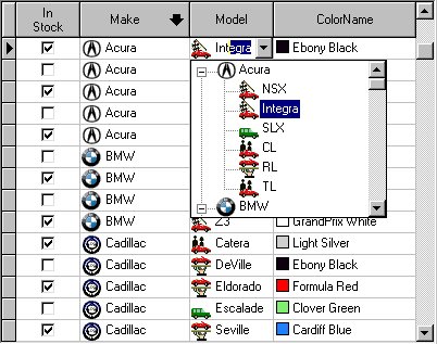
Add impact to your InfoPower
grid and record-view controls. 1stClass edit controls (such as its TreeCombo) and graphic controls (such as buttons, trackbars, etc.) can be easily embedded into the InfoPower grid. Just
select the 1stClass control from the standard select fields dialog boxes within
InfoPower’s grid designer.
The Tree Combo's icons and the Color Combo's
colors can even be displayed on every row of the InfoPower
grid.
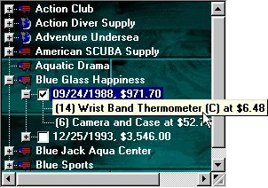
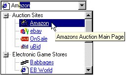
Tree-View Controls
Included in 1stClass are powerful versions of both a data-bound and unbound
tree view control.
Unbound Tree View : This versatile, elegant, and attractive tree view component supports
checkboxes, radio buttons, smart URL links, three-dimensional buttons,
multi-selection, custom colors and fonts, and so much more.
Use the checkboxes to
store boolean information
for any node in the tree. When used with multi-selection, checkboxes can be
used to represent which nodes are selected. The native power of this tree view
allows you to link URL addresses directly into the treeview.
The treeview can dynamically open the URL address,
display the node in a URL link display format, and display the hand-point when
the mouse is over the URL link.
Data-Bound Tree View 
Integrated header support when building a self-referencing data-bound tree.
This advanced and sophisticated data-bound
tree-view can single-handedly navigate all the tables and queries in your
master/detail relationships. What sets this tree view apart from any other is
that it is truly a live connection to your data. The tree is live
and buffered, allowing for extremely fast loading, even for large
tables.
 Just tell the treeview control the top and bottom level datasources you wish for it to display,
and the control will handle the rest of the details.
Just tell the treeview control the top and bottom level datasources you wish for it to display,
and the control will handle the rest of the details.
With a truly live connection to your data,
filters, ranges, sorting by indexes, searches, and edits on the data are all
instantly respected.
When using a sequencable
back-end such as Paradox, the scrollbars are proportional and smooth.
In addition, the tree-view supports hot-tracking,
checkboxes, imagelist support (so that each node can
display its own icon), a background image, and more.
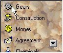
Tree Combos - Easy Hierarchical Organization
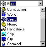
The Tree Combo is perfect to hierarchically organize
and display items in a drop-down list. Similar to the combo found in the
Windows Explorer address combo, the component supports most of the
functionality found in the 1stClass Tree View,
including the display of images.
InfoPower Support! If you are also using
Woll2Woll’s InfoPower, you can embed the TfcTreeCombo into InfoPower’s
grid and record-view components.
Fully supports the Quicken-style for incremental
searching. While typing in text, the closest match can automatically be
selected with the remaining characters highlighted.
Or you can choose to use the TfcTreeCombo in a non-heirarchical
fashion to create your own image combos.
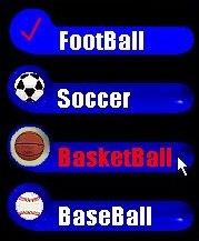
OutlookBar - Perfect for grouping
controls or items into logical subsets.


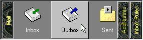
At
its most basic level, the OutlookBar can accomplish
as much as users have come to expect from using Microsoft Outlook. You can
display any number of groups of ListView like
controls inside. Of course when switching groups, the panels
and buttons slide in a smooth, animated fashion. Each of the "listviews" (OutlookLists)
inside can allow it's items to be either clicked on or
selected (like a radio group). As you move your mouse over the items, the items
will hot-track to your mouse cursor.
However, beyond this
already impressive array of features, even more functionality is possible! The
buttons inside can be 1stClass Shape or Image buttons and can therefore appear
however you like. Each separate group contains a container panel that allows
you to drop any control you wish into the OutlookBar.
Both the OutlookBar itself, and each of the OutlookLists
can be oriented either vertically or horizontally. To take advantage of
the vertical buttons, the text inside the buttons can be easily rotated, in
addition to all the features found in a 1stClass label.
The hot-track style of
the OutlookList can be either that found in Microsoft
Outlook, where each item's icon is embossed outward, or the style found in
Microsoft Outlook Express; where each item is embossed outward and colored
silver.
Image-Shaped Forms - Create spectacular forms of any shape and
background as defined by your own custom image.
Just load any image into the image property of
the TfcImageForm and your form's shape and background
will look exactly like that image. With this component, your form's shape is
not limited to the standard rectangles of ordinary windows.
You assign the image form a bitmap and
designate one of the colors of that bitmap as transparent. Those pixels will be
excluded from the bounds of the form.
Actual Form Created With 1stClass!

Another Form Created With 1stClass!
Awesome shaped buttons
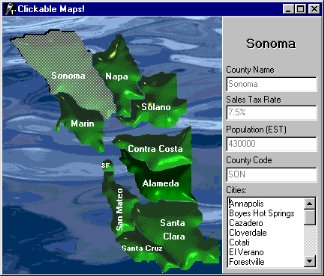
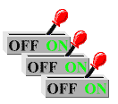
Image Button - This image button allows
you to create your own custom images and have the button take on its shape and
appearance. Defined by a specified transparent color, the boundaries of the
button will perfectly match that of the defined image. Sophisticated data entry forms using clickable
maps are possible with these controls.
You can define a different image for the up and
down state of the button which allows you to create awesome switches, led
lights, and many other types of buttons.
The abilities of the native TButton,
TBitBtn, and TSpeedButton
are all encapsulated by these buttons.
Shape Button
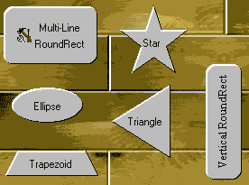 Choose from an arrow,
diamond, ellipse, rectangle, round rectangle, star, trapezoid, triangle, or
virtually any other shape you can imagine. Each shape you create, even custom shapes,
can be individually oriented to any of four directions: Up, Down, Left, and
Right.
Choose from an arrow,
diamond, ellipse, rectangle, round rectangle, star, trapezoid, triangle, or
virtually any other shape you can imagine. Each shape you create, even custom shapes,
can be individually oriented to any of four directions: Up, Down, Left, and
Right.
Unlike the standard buttons, these buttons
fully support the color property. In addition, the captions of the buttons can
be manipulated to same degree that our label component can.
Ultimate Label Control

This label control
enables the easy creation of impressive text effects such as shadows,
extrusions, engraved, embossed, or outline effects.
Just a few of the extraordinary features found
in this label control are:
- All true type fonts can be rotated a full
360 degrees.
- Impressive extrusions can be added to give
a 3D look to the label and make it appear to jump out of the screen.
- Emboss the text so that appears to bevel
into the screen, or come out of the screen in bas-relief.
- Have the label paint its text with a nice
outline around the letters of the text.
- Give the text a shadow and place it
anywhere in relation to the text.
Powerful Status Bar
 The
large assortment of built in styles in this status bar will automatically allow
you to add glyphs, date/time, date, time, numlock,
overwrite, control and menu hints, computer info, richedit
line and column numbers, and even your own custom controls.
The
large assortment of built in styles in this status bar will automatically allow
you to add glyphs, date/time, date, time, numlock,
overwrite, control and menu hints, computer info, richedit
line and column numbers, and even your own custom controls.
The text that appears for any style of any of the panels can be easily overridden and/or custom drawn. In addition, the text can make complete use of the 1stClass text options, which allows for all the text effects seen in the label control.
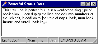
The width of each of the panels in the status bar can be individualy set to a pixel value (i.e. 75 pixels) or a proportional value (i.e. 25%). As an example, in Internet Explorer, the left hand panel would be set to a value of 100%, and the rest would be set to concrete pixel values.
Sophisticated and Flexible Color Controls


1stClass includes two powerful controls for allowing end-users to choose colors.
Color Listbox - When you use this control, you give your users the ability to naturally select any number of colors in an intuitive interface. Display the standard system colors, a dynamic grayscale, or fill a list with all the colors you can imagine.
Color Combo - This color combo provides your end-users with the ability to easily select any color you or, if you like, they, want from a powerful drop-down color list.
Both controls allow for sophisticated sorting to be applied to the list of colors. The colors can be sorted by name, so that colors will appear alphabetically ordered. They can also be sorted by intensity so that the colors can be ordered from dark to light. In fact, they can even be sorted by the colors of the rainbow.
Versatile Font Combo Control

This combo control allows you to allow your end
users to selectively preview and choose fonts from a drop-down list control.
Just a few of the extraordinary features found in
this label control are:
- Enables your end-users to preview the
fonts by just moving the mouse over the selection.
- Customize the preview text
- Contains a built-in history list that
keeps track of the most recently used fonts just like in Microsoft Word!
- Supports TrueType and Printer icons.
- Contains an event that allows you to
accept or reject certain fonts from appearing in the drop-down list.
- Fully supports the Quicken-style
for incremental searching. While typing in text, the closest match can
automatically be selected with the remaining characters highlighted.
Dynamic and Expansive Button Groups


The TfcButtonGroup
allows the creation of a collection of custom-designed buttons, radio buttons,
or checkboxes from a single component. Use a this
control to organize buttons into logical groups, easily create radio button
groups, checklist style groups, or a group of standard buttons. It has the
ability to either contain a collection of shape buttons (TfcShapeBtn)
or image buttons (TfcImageBtn).
Easily allow the caption for each of the
buttons to become bold as they are pressed down. Lay out the buttons in either
a vertical or horizontal fashion. Group the buttons into any number of
columns.
Fantastic
Image Manipulation

The Imager Control allows for the easy creation
of spectacular images which can be integrated into any application. All of the
effects available through this control can be easily manipulated by setting
just a few properties.
Some of the many effects that can be applied to
the image are:
- Alpha blending gives you the capability of
partially blending in one bitmap with another.
- You can change the colors of the image to
appear in a sort of cellophane tint of another color.
- Easily adjust the brightness and contrast
of your bitmaps.
- Sharpen the picture for increased clarity
or apply a beautiful gaussian blur.
- Flip the image vertically, horizontally,
or rotate it by any degree.
- Adjust the saturation of the colors to
either take away colors, making the image appear almost black and white,
or increase the colors and make the bitmap more vibrant.
TrackBar and ProgressBar – Use 1stClass’ TrackBar
and PogressBar with or without your database.
Trackbar


·
The 1stclass trackbar can be
bound to a database field (integer or floating point), or can be used unbound.
·
Use it inside an InfoPower
vertical or horizontal grid (TwwDataInspector), or
use it in a DBCtrlGrid.
·
Can be inverted so that the highest most value is at
the top instead of the bottom
·
Can display tick text labels automatically
·
Can display a formatted text value representing the
current track position
·
Numerous properties to fine-tune the track bar's
display including custom bitmaps for the thumb
·
Supports themes
Progressbar
·
The 1stClass ProgressBar can be bound to a
database field, calculated field (integer), or can be used unbound.
·
Use it inside an InfoPower vertical or
horizontal grid (TwwDataInspector), or use it in a
DBCtrlGrid.
·
Can display a formatted text value representing the current progress
·
Numerous properties to fine-tune the track bar's display
·
Supports themes
See http://www.woll2woll.com/Ordering.html
for further details on ordering Woll2Woll products, and special upgrade
pricing.